- Google Cloud
- Cloud Forums
- Apigee
- Analytics custom reports getting no. of transactio...
- Subscribe to RSS Feed
- Mark Topic as New
- Mark Topic as Read
- Float this Topic for Current User
- Bookmark
- Subscribe
- Mute
- Printer Friendly Page
- Mark as New
- Bookmark
- Subscribe
- Mute
- Subscribe to RSS Feed
- Permalink
- Report Inappropriate Content
- Mark as New
- Bookmark
- Subscribe
- Mute
- Subscribe to RSS Feed
- Permalink
- Report Inappropriate Content
how to generate custom reports on the basis like getting how many transactions we had hit in 1 sec and how many took 2 sec and so on as shown below.
is there any possble way to achieve this data in apigee?
@anil sagaroutput.png
- Labels:
-
Analytics
- Mark as New
- Bookmark
- Subscribe
- Mute
- Subscribe to RSS Feed
- Permalink
- Report Inappropriate Content
- Mark as New
- Bookmark
- Subscribe
- Mute
- Subscribe to RSS Feed
- Permalink
- Report Inappropriate Content
Good question. I think you're talking about a histogram.
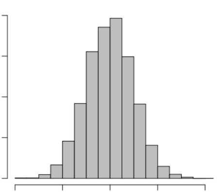
You said you wanted to look at how many calls respond in less than 1 second, how many take between 1 and 2 seconds, how many between X and Y seconds. (more likely you will want smaller granularity - like 100ms to 200ms, 200ms to 300ms, and so on). A representation of that might look like this:
The bucket or time-slot index is shown on the horizontal (x) axis, while the count of calls is shown on the vertical (Y) axis.
That kind data, count of calls based by bucketed response time, is not available by default within the Apigee Edge Analytics UI. But, there is an easy way to build that view!
You can use a StatisticsCollector policy and a JS policy. All you would need to do is:
- in the JS policy, compute the time bucket. Bucket 1 might imply <1s, while bucket 2 implies between 1 and 2s, and so on. Or use your own smaller-grained time slots. You would do this by subtracting the value of client.sent.start.time from client.received.start.time, dividing by the bucket size (1000ms, or 250ms, or whatever), and storing the result into a context variable (maybe "responsetime_bucket").
- Then, use StatisticsCollector to then store that "responsetime_bucket" context variable into the AX record.
After you run some transactions through the API, the "responsetime_bucket" will automatically appear in the dimensions in the AX UI, and you'll be able to generate and view that chart.
Out of the box, the Apigee Edge Analytics UI allows you to chart the TP50, TP95 and TP99 for response time, over time. This view is often preferred by people who monitor the performance of their APIs because the chart does not use pre-conceived buckets with time ranges for examining response time. Here's the thinking: People running high volume systems don't really care how many calls took between 400ms and 500ms. They reason: Anything under 350ms is fine. If 99% of customers get responses in under 350ms, they're happy. (In that case TP99 would be 350ms). If TP99 is 880ms, then ... a significant number of customers are getting less than satisfactory response time.
The TPXX charts invert the analysis: TP95 shows you the ACTUAL response time under which 95% of the calls return. That might be 750ms, or it might be 673ms. It's based on actual observed data. A histogram prescribes the time ranges and examines which calls fall into which ranges.
-
Analytics
497 -
API Hub
75 -
API Runtime
11,657 -
API Security
174 -
Apigee General
3,020 -
Apigee X
1,253 -
Developer Portal
1,906 -
Drupal Portal
43 -
Hybrid
459 -
Integrated Developer Portal
87 -
Integration
308 -
PAYG
13 -
Private Cloud Deployment
1,065 -
User Interface
74
| User | Count |
|---|---|
| 6 | |
| 2 | |
| 1 | |
| 1 | |
| 1 |

 Twitter